Close


Zhao talks about the secret and meaning behind the Binance logo. Chang Peng Zhao (CZ) explains the secret behind the Binance logo. In this Pooyanmusic post, you will read the interesting story of the Binance logo.
The head of the largest digital currency exchange Binance has shared the story of how he and his team created the platform’s eye-catching logo.
t post, X, the founder and CEO of Binance Exchange, the largest digital currency trading platform by volume, discussed how to create the Binance logo.
After creating the logo, CZ and his friends Luke and Garrett – who are said to be a Binance co-founder – got together in Singapore. They wanted to get the Binance logo tattooed on their arms. This happened in 2018.
According to CZ, the logo was created 16 months earlier, in the summer of 2017, the year the platform was launched with the help of an ICO. ICOs were a popular method of fundraising in the crypto industry at the time.
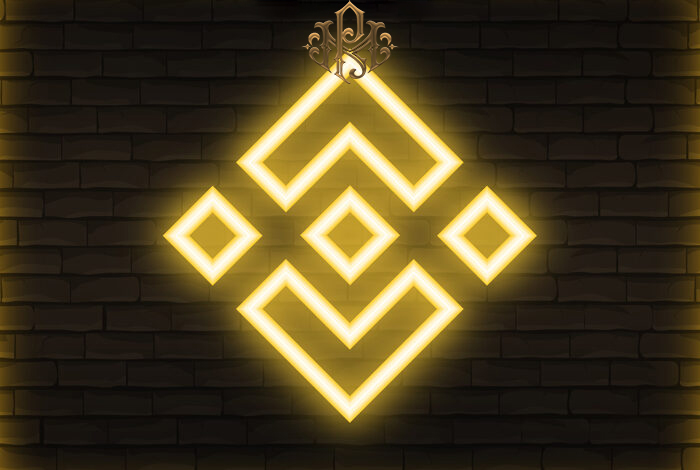
The interesting story of the design of the Binance logo
CZ admitted that he and the other co-founders tried different variations to create a logo for their crypto exchange. The idea was to show bids and asks on Binance using two squares. As for the title itself, Binance stands for “Binary Finance”.
CZ wrote that they placed one square on top of another to almost resemble a “digital eight”. Although it is a lucky number in Chinese culture. But they didn’t like the result. Tang, the Binance designer, suggested a few more changes, CZ says, noting two diagonal squares on top of each other, with a slight overlap in the figure of two. This was more appealing to CZ than two overlapping squares, as the overlap symbolized offers and requests.
The next idea they used was to stack these small squares on top of a larger square, like two pieces on a game board. It is a symbol of a crypto exchange that acts like a “playground” for trading. However, even then the logo seemed “weak” for CZ. Then, Binance designers simply thickened the lines of all the squares. That was the whole story, CZ proudly wrote.

